Web-Based Form Technology
DriveWorks 21 introduces a unified web-based Form technology which provides a much more consistent and usable experience in the Form Designer of DriveWorks Solo.
While this use of web technology behind the new Forms Designer will ease the transition to DriveWorks Pro and browser-based DriveWorks projects, it also provides a host of benefits to native DriveWorks Solo forms.
The Web Form Technology controls have an added consistency in look, behavior, and sizing that makes it faster and easier to create great, professional quality forms in DriveWorks Solo.
What will happen to my existing forms?
In the majority of cases there will be little noticeable difference when upgrading your Projects to DriveWorks 21.
Realistically, you may need to do a little tweaking here and there to make things line up perfectly.
There should be no more difference than a pixel or two, so if you designed your forms with some buffer space they should be perfectly fine.
The section below (Form Control Visual And Style Changes) details exactly what has changed for each control.
We do recommend taking a backup of the DriveWorks data before opening any Group in DriveWorks 21.
How will this affect how I work?
With regards to using the Form Design task, nothing has changed.
Moving to this technology has allowed some enhancements to be incorporated into the Form Design task.
Form Design
The following lists the changes made to the Form Design task as part of the Web Form Technology implemented in DriveWorks 21.
| Change | Reason |
|---|---|
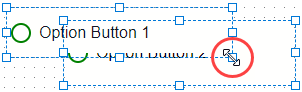
| Control Grips When multiple overlapping controls are selected, the grips have the same Z order as the selected controls. The resize grips of the top most control will take precedence over any below (which may be inaccessible).
| Easier and more logical Control selection. |
| Control Boundary The boundary of a control displays an outline on hover when unselected.
| Allows instant identification of the control that will be selected before clicking.
Assists with selecting stacked and overlapping controls. |
| Right Click (Context) Menu Renaming is disabled when multiple controls are selected. | Only one control can be renamed at a time.
The previous behavior did not respect which control was selected first/last to rename, and renamed the first selected item in the control tree. |
Form Control Visual And Style Changes
The following are visual and style changes to controls as part of the Web Form Technology implemented in DriveWorks 21.
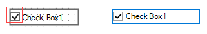
Check Box
| Property or Element | Change |
|---|---|
| Check Cell |
Size of check cell reduced from 16px x 14px to 14px x 14px by default. This adopts a standard with the input cells of other controls (for example the Option Button) and gives visual consistency. The cell is a true square for easier alignment. |
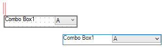
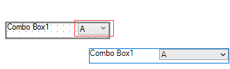
Combo Box
| Property or Element | Change |
|---|---|
| Caption |
Left padding (3px) removed. Aligns to the left edge of the control bounds. Consistent with other controls. |
| Input Height
Input Value |
|
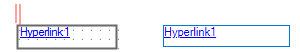
Hyperlink
| Property or Element | Change |
|---|---|
| Text |
Removed left padding (3px). Aligned to control bounds. Easier alignment with other controls. |
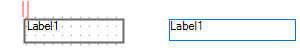
Label
| Property or Element | Change |
|---|---|
| Text |
Removed left padding (3px). Aligned to control bounds. Easier alignment with other controls. |
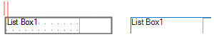
List Box
| Property or Element | Change |
|---|---|
| Caption |
Removed left padding (3px). Aligned to control bounds. Easier alignment with other controls. |
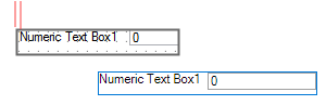
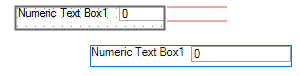
Numeric Text Box
| Property or Element | Change |
|---|---|
| Caption |
Removed left padding (3px). Aligned to control bounds. Easier alignment with other controls. |
| Input Height |
Increased to 16px (from 15px). Visual consistency with other controls. Better alignment vertically and horizontally. |
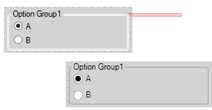
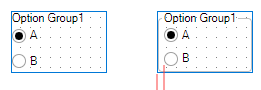
Option Group
| Property or Element | Change |
|---|---|
| Fieldset Border |
Now uses a simpler 1px grey border around the fieldset, previously 3px (white|grey|white). Positions border at control bounds. Easier alignment with other controls. |
| Show Border Property |
When false, all inner padding is removed from the Caption (legend) and fieldset. Aligns Options to edge of control. Easier alignment with other controls. |
| Hover/Selected Pictures | Now shows selected state immediately when selected without moving the mouse. |
| Caption | When long Captions are used, the overflowed text is aligned to the top, always showing the start of the Caption.
Consistent with the Option Button. |
| Override Rule | If there is a Override Rule applied, when another Option is clicked, there will be a visual flicker as the server corrects the visual state of the Options.
The Option Group’s UI is not blocked for responsiveness. The change is made client-side immediately, and then corrected by the server if necessary. |
Picture Box
| Property or Element | Change |
|---|---|
| File Name
Picture (Hover) |
|
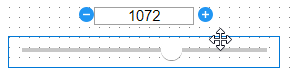
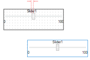
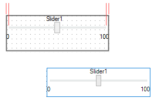
Slider
| Property or Element | Change |
|---|---|
| Caption |
|
| Track |
Outer padding calculated to half Thumb width/height, depending on orientation. No longer fixed 5px from control bounds. Logically sized to the draggable area, aligned over center point of the Thumb. |
| Thumb | Now shows drag and dragging cursors on interaction.
The previous pointer cursor implied incorrect interaction. |
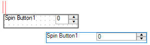
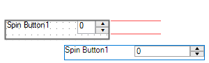
Spin Button
| Property or Element | Change |
|---|---|
| Caption |
Removed left padding (3px). Aligned to control bounds. Easier alignment with other controls. |
| Input Height |
Reduced to 16px (from 20px). Visual consistency with other controls. Better alignment vertically and horizontally. |
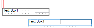
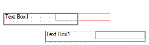
Text Box
| Property or Element | Change |
|---|---|
| Caption |
Removed left padding (3px). Aligned to control bounds. Easier alignment with other controls. |
| Input Height |
Increased to 16px (from 15px). Visual consistency with other controls. Better alignment vertically and horizontally. |
- Welcome
- What's New
- DriveWorks 23
- Older Versions
- DriveWorks 22
- DriveWorks 21
- DriveWorks 20
- DriveWorks 19
- DriveWorks 18
- DriveWorks 17
- DriveWorks 16
- DriveWorks 15
- DriveWorks 14
- DriveWorks 12
- What's New DriveWorks 12
- Form Design
- Rule Builder
- Model Rules
- DriveWorks Add-in for SOLIDWORKS
- SP1
- SP2
- DriveWorks 11
- Welcome to DriveWorks Solo 11 What's New
- Capturing
- Project Designer
- Installation
- Licensing
- SP1
- SP1.1
- SP2
- SP3
- V10
- V9
- V8
- SP0
- SP1
- SP2
- SP3
- V7
- Before You Begin
- Using DriveWorks Solo
- DriveWorks Solo Inside SOLIDWORKS
- Enabling the DriveWorks Solo Add-ins in SOLIDWORKS
- Project Wizard
- Capturing Models
- Captured Models
- Part Mode
- Assembly Mode
- Drawing Mode
- Run
- Run (Layout Mode)
- Project Designer
- Project Designer
- Stage 1: User Interface
- Stage 2: Data and Rules
- Stage 3: Output Rules
- Writing Rules
- Writing Rules
- Rules Builder
- Extract Variable
- Edit Variable
- Rule Builder Settings
- Document Rules
- Model Rules
- Model Rules Overview
- Parts and Assemblies
- File Name
- Relative Path
- Configuration
- Feature
- Dimension
- Tolerances
- Custom Property
- Instance
- File Formats
- Advanced Feature Parameter Rules
- Model Rules Advanced Feature Parameter Rules - Overview
- Boss/Base Features
- Boss/Base Thin
- Break Corner
- Chamfer
- Circular Component Pattern
- Circular Pattern
- Coordinate System
- Cosmetic Thread Features
- Curve
- Curve Driven Pattern
- Curve Through XYZ Points
- Cut Features
- Distance Mate Features
- Draft
- Edge Flange
- Features
- Fillet
- Hole Wizard Features
- Linear Component Pattern
- Circular Pattern
- Linear Pattern
- Lofted Bend
- Mates
- Mold Features
- Offset Surface
- Pattern Driven Component Pattern (Derived)
- Patterns with Advanced Feature Parameters
- Revolved Boss/Base
- Revolved Boss/Base Thin
- Rib
- Ruled Surface
- Sheet Metal Features
- Simple Hole
- Sketch Driven Pattern
- Slot Mate
- Surface Features
- Sweep Thread
- Table Driven Pattern
- Var Fillet
- Weldment Features
- Wrap
- Drawings
- Functions
- Functions
- Conversion
- Cryptography
- Date and Time
- File System
- Helper
- Lambda
- List
- Logical
- Math
- Specification
- Table
- CountIF
- CSVFromTable
- Dcount
- DMax
- DMin
- DWHLookup
- DWVLookup
- GetTableValue
- HLookup
- ListAll
- ListAllConditional
- ListAllConditionalDistinct
- ListAllDistinct
- SumTableColumn
- TableAppendColumns
- TableAppendRow
- TableAppendRows
- TableAverage
- TableBreak
- TableColumn
- TableColumnLookup
- TableCombine
- TableDistinct
- TableDistinctCount
- TableDistinctSum
- TableFilter
- TableFilterAll
- TableFilterByList
- TableFormat
- TableFromCsv
- TableFromList
- TableGetColumnCount
- TableGetColumnIndexByName
- TableGetDataRows
- TableGetHeaderRow
- TableGetRowCount
- TableGetRows
- TableGetValue
- TableJoin
- TableMax
- TableMaxValue
- TableMin
- TableMinValue
- TableRemoveBlankColumns
- TableRemoveBlankRows
- TableRemoveColumn
- TableRemoveRow
- TableReplaceHeaderRow
- TableReplaceHeaders
- TableReplaceRow
- TableReverse
- TableRow
- TableSearch
- TableSelectColumns
- TableSequence
- TableSkipRows
- TableSort
- TableSortByDate
- TableSortByList
- TableSubstitute
- TableSum
- TableTakeRows
- TableTranspose
- TableWithSequence
- VLookup
- Text
- Validation
- Variables
- Knowledge Base
- Concept
- How To
- How To: SolidWorks Best Practices
- SOLIDWORKS Best Practices (KB13103019)
- SOLIDWORKS Features
- How To: Correctly Format Text
- How To: Backup a Project (KB13022601)
- How To: Change A Static Property To A Dynamic Property (KB13111201)
- How To: Create A Cut Down Project (KB17092602)
- How to: Create and Install Project Templates
- How To: Determine the Version of DriveWorks Solo
- How To: Diagnose Project Issues
- How To: Diagnose Project Issues Using On Demand Generation Report
- How To: Diagnose Project Issues Using The Form Designer
- How To: Diagnose Project Issues Using The Rules Builder
- How To: Diagnose Project Issues Using SOLIDWORKS
- How To: Drive the Color of a Part (KB12121016)
- How To: Drive the Material of a Part
- How To: Drive the Texture of a Part (KB13103010)
- How To: Find DriveWorks Solo License Keys
- How To: Implementation Guide
- How To: Reference Control Properties (KB16010601)
- How To: Rename a Project
- How To: Replace a Component With a Static or Driven Replacement Model
- How To: Replace An Instance With A Driven Replacement Model
- How To: Maintain Rules For An Existing Model When It Becomes A Child Of A Parent Assembly
- SOLIDWORKS Best Practices (KB13103019)
- How To: Troubleshoot Licensing
- How To: Troubleshoot WebView2 Runtime Installation (KB25102401)
- How To: Work With Arrays
- How To: Use Filters (KB15111101)
- Info
- Form Control Properties
- Color
- Border Style
- Border Width
- Button Layout
- Caption, Text (Appearance Property)
- Caption Horizontal Alignment
- Button and Caption Width
- Character Limit
- Check Alignment, Option Alignment
- Checked
- Check Size, Radio Size, Button Icon Size, Toggle Size
- Clear Selection Allowed
- Decimal Places
- Default Value
- Display Value
- Enabled
- Error result
- File Name
- Font
- Height
- Hide Characters
- Hover, Text Underline
- Hyperlink
- Button Icon Style
- Increment
- Inset Track
- Input Spacing
- Items
- Left
- Link Behavior
- Maximum
- (Metadata)
- Minimum
- Multiline
- Name
- Number Of Rows
- Opacity (Disabled)
- Orientation
- Override Rule
- Padding, Input Padding, Unit Padding
- Picture
- Picture (Checked), (Hover), (Selected), (Pressed)
- Picture Size Mode, Size Mode
- Picture Style
- Placeholder Text
- Border Radius
- Read Only
- Reverse Direction
- Selected Item
- Selected Item Removed Behavior
- Show Border
- Show Check, Show Option
- Show Limits
- Show Toggle Indicators
- Size Mode
- Tab Index
- Tag
- Text Horizontal Alignment, Toggle Alignment
- Text (Label Control)
- Text, Value (Behavior Property)
- Text, Vertical Alignment
- Thumb Height
- Thumb Image
- Thumb Image Size Mode
- Thumb Margin
- Thumb Padding
- Thumb Width
- Tooltip Duration
- Tooltip Text
- Top
- Track Color
- Track Color (Fill)
- Track Fill Start Value
- Track Size
- Visible
- Width
- Word Wrap
- File and Template Locations
- Info: DriveWorks File Extensions (KB13022602)
- Info: File and Template Locations (KB13103001)
- Template Files
- Lists and Preferences
- Reporting
- Help File
- General Information
- Info: Dangling Dimensions
- Info: Distributing A Solo Project
- Info: DriveWorks Solo Limits
- Info: Instant3D
- Info: Keyboard Shortcuts (KB13103004)
- Info: Known Issues (KB13103005)
- Info: Legal Notices
- Info: Microsoft .NET September 2022 Update Crash (KB22101401)
- Info: Mirrored Components
- Info: SOLIDWORKS System Options (KB12121012)
- Info: Special Variables
- Info: Supported DriveWorks Versions (KB13103006)
- Info: Third Party Information And Downloads
- Info: Microsoft Windows Support (KB13010803)
- Info: Working With SOLIDWORKS Enterprise PDM
- Glossary