Appearance
- Background Color
Specifies the color of the control's background.
- Input Opacity (Disabled)
Specifies the opacity of the control's input area when the control is disabled, between 0 and 100.
- Input Spacing
Specifies the spacing between inputs in the control.
- Inset Track
Specifies whether the Track is inset from the edge of the Control. True to align the Thumb midpoint with the Track ends, or False to extend the Track to the Control's boundary.
- Orientation
The display orientation of the control.
- Reverse Direction
Reverses the direction of the slider control
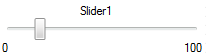
- Show Limits
Specifies whether to show the minimum and maximum value limits on the control.
- Thumb Background Color
Specifies the background color of the slider's thumb.
- Thumb Background Color (Disabled)
Specifies the background color of the slider's thumb when the control is disabled.
- Thumb Background Color (Hover)
Specifies the background color of the slider's thumb when in a hovered state.
- Thumb Background Color (Pressed)
Specifies the background color of the slider' s thumb when in a pressed state.
- Thumb Height
Specifies the height of the Slider's Thumb.
- Thumb Margin
Specifies the margin of the Thumb from the edge of the Control. This can be used to make the Thumb appear inside of the Track.
- Thumb Padding
Specifies the padding of the Slider's Thumb.
- Thumb Width
Specifies the width of the Slider's Thumb.
- Track Color
Specifies the color of the slider's track.
- Track Color (Fill)
Specifies the color of the filled part of the slider's track.
- Track Size
Specifies the size of the slider's track.