Form Design
The form designer is where you will administer the controls you want displayed on each of your forms. It provides you with a great deal of flexibility in the way that controls are displayed due to its support for X/Y positioning for all form controls, and control over fonts, colors, and more.

The main areas of the form designer are:
- The alignment command group on the command bar
- The toolbox command group on the command bar
- The form design area
- The forms list
- The property grid
Understanding the Property Grid
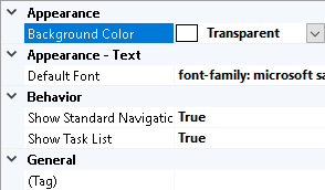
If you click on a control, the property grid changes to show all of the properties of that control, and their current values, the image below shows an example of the property grid for a text box:

The property grid is made up of the following areas:
- Two buttons which toggle between categorized and alphabetical views
- Two columns, property names on the left, and property values on the right.
- A description of the currently selected property.
To the right of each property name is either a gray or a green circle.
A gray circle indicates that a value is a fixed or static value, meaning you can control it in the property grid, but you can't control it with a rule.
A green circle indicates that the value is dependent on a rule which you can build using the rules builder. If you select a property which has a green circle in the name, a button appears to the right of the property value which launches the rules builder.
User Form Properties
Properties for each User Form can be set by clicking on the form in Form Design mode.
These include:
- Background Color - Sets the background color of the user form
- Show Task List - Determines if the Task List will be displayed for this form.
- (Tag) - Allows an alternative name or description for the user form to be entered.
Creating a Form Control
To create a new form control:
- Make sure that a form is selected in the forms list
- Click the toolbox entry for the type of control you want to create.
- Give the control a name.
- Click "OK"
The form controls that DriveWorks Solo supports are:
| Type | Description |
|---|---|
| Check Box | A control which allows a user to toggle between TRUE/FALSE. |
| Check Box Group | Allows multi-selection of a group of static or dynamic items. | Picture Box | A control which can display a picture whose path can either be a fixed value, or the result of a rule. |
| List Box | A list of options from which the user can select a single item. |
| Numeric Text Box | A text box which only supports numeric input within a fixed or dynamic range of values. |
| Combo Box | A list of options, in the form of a drop down list, from which the user can select a single item. |
| Option Group | A list of options, in the form of radio buttons, from which the user can select a single item. |
| Label | Provides a way of displaying fixed or dynamic text on a form. |
| Spin Button | A control which supports numeric input within a fixed or dynamic range of values, and with buttons that increment or decrement the value of the control by a certain amount. |
| Text Box | A control which supports textual input. |
| Hyperlink | A control that displays a label where a hyperlink can be set that opens a new window to a specified URL. |
| Slider | A control that displays a slide bar which represents a numeric value. |
| Toggle Switch | Allows on or off (yes or no) selections to be made. |
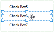
Form Controls can be grouped so they move as one when repositioning is required.
Group Controls
Form Controls can be grouped so they move as one to reposition in the form view.
Selecting grouped controls from the form, will display the following in the property panel:
- All properties common to each control in the group.
- All property values common to each control in the group.
- Where a property is common but the value is not, the values will not be displayed.
Changing a property value will apply that value to all controls in the group (when all controls in the group are displayed as selected on the form).
A grouped control can be isolated (to change a property for that control only) by double clicking the control on the form.
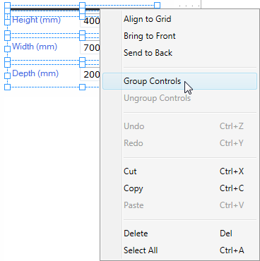
To Group Controls
Controls can be grouped by:
- Select 2 or more controls from the same user form.
- Right click on one of the selected controls.
- Select Group Controls from the menu.
To Ungroup Controls
Controls can be ungrouped by:
- Select a group of controls from the user form.
- Right click on the group.
- Select Ungroup Controls from the menu.
Zoom
The Form in view can have the zoom level set by selecting the required buttons from the command bar.
- Zoom +
Increases the zoom level, in 10% increments, to maximum 500%
- Zoom -
Decreases the zoom level, in 10% increments, to a maximum of 20%
- Reset Zoom
Resets the zoom scale to 100%.
This option is only available when the Form in view is not at 100%.
100% is the level that the User Form will always be displayed at when in a Specification.
The above options are also available by right clicking on the User Form.
See Info: KeyBoard Shortcuts for more information.
Aligning Form Controls
To align two or more form controls, either box select (by click-dragging the form design surface), or control-select each control you wish to align, and then press the relevant alignment button.
The following alignment tools are available:
- Align Left
- Align Vertical Centers
- Align Right
- Align Horizontal Centers
- Align Middle
- Align Bottom
- Space Evenly Vertically
- Space Evenly Horizontally
Control guides allow quick and accurate alignment of controls when designing user forms.
Control guides appear when controls are moved on the user form.
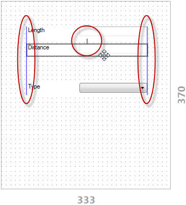
Control Guides align to other controls in 2 ways:
- Margin Guides - Snap a set distance away from another control.
- Alignment Guides - Snap to the edges of another control.
Accurate Positioning of Form Controls Using Keyboard Arrows.
For fine tuning of control positions the keyboard arrow keys can be used move the selected control 1 pixel at a time.
- Select a single control or multiple controls to be moved.
- Press and hold the Alt key on the keyboard and the arrow key that corresponds to the direction the control is to be moved.
- Alt +
 - Move the control(s) 1 pixel up.
 - Alt +
 - Move the control(s) 1 pixel left.
 - Alt +
 - Move the control(s) 1 pixel down.
 - Alt +
 - Move the control(s) 1 pixel right.
Testing a Form
You can use the "Test" button on the command bar to try out your form, and to set default values for controls.
- Welcome
- What's New
- DriveWorks 23
- Older Versions
- DriveWorks 22
- DriveWorks 21
- DriveWorks 20
- DriveWorks 19
- DriveWorks 18
- DriveWorks 17
- DriveWorks 16
- DriveWorks 15
- DriveWorks 14
- DriveWorks 12
- What's New DriveWorks 12
- Form Design
- Rule Builder
- Model Rules
- DriveWorks Add-in for SOLIDWORKS
- SP1
- SP2
- DriveWorks 11
- Welcome to DriveWorks Solo 11 What's New
- Capturing
- Project Designer
- Installation
- Licensing
- SP1
- SP1.1
- SP2
- SP3
- V10
- V9
- V8
- SP0
- SP1
- SP2
- SP3
- V7
- Before You Begin
- Using DriveWorks Solo
- DriveWorks Solo Inside SOLIDWORKS
- Enabling the DriveWorks Solo Add-ins in SOLIDWORKS
- Project Wizard
- Capturing Models
- Captured Models
- Part Mode
- Assembly Mode
- Drawing Mode
- Run
- Run (Layout Mode)
- Project Designer
- Project Designer
- Stage 1: User Interface
- Stage 2: Data and Rules
- Stage 3: Output Rules
- Writing Rules
- Writing Rules
- Rules Builder
- Extract Variable
- Edit Variable
- Rule Builder Settings
- Document Rules
- Model Rules
- Model Rules Overview
- Parts and Assemblies
- File Name
- Relative Path
- Configuration
- Feature
- Dimension
- Tolerances
- Custom Property
- Instance
- File Formats
- Advanced Feature Parameter Rules
- Model Rules Advanced Feature Parameter Rules - Overview
- Boss/Base Features
- Boss/Base Thin
- Break Corner
- Chamfer
- Circular Component Pattern
- Circular Pattern
- Coordinate System
- Cosmetic Thread Features
- Curve
- Curve Driven Pattern
- Curve Through XYZ Points
- Cut Features
- Distance Mate Features
- Draft
- Edge Flange
- Features
- Fillet
- Hole Wizard Features
- Linear Component Pattern
- Circular Pattern
- Linear Pattern
- Lofted Bend
- Mates
- Mold Features
- Offset Surface
- Pattern Driven Component Pattern (Derived)
- Patterns with Advanced Feature Parameters
- Revolved Boss/Base
- Revolved Boss/Base Thin
- Rib
- Ruled Surface
- Sheet Metal Features
- Simple Hole
- Sketch Driven Pattern
- Slot Mate
- Surface Features
- Sweep Thread
- Table Driven Pattern
- Var Fillet
- Weldment Features
- Wrap
- Drawings
- Functions
- Functions
- Conversion
- Cryptography
- Date and Time
- File System
- Helper
- Lambda
- List
- Logical
- Math
- Specification
- Table
- CountIF
- CSVFromTable
- Dcount
- DMax
- DMin
- DWHLookup
- DWVLookup
- GetTableValue
- HLookup
- ListAll
- ListAllConditional
- ListAllConditionalDistinct
- ListAllDistinct
- SumTableColumn
- TableAppendColumns
- TableAppendRow
- TableAppendRows
- TableAverage
- TableBreak
- TableColumn
- TableColumnLookup
- TableCombine
- TableDistinct
- TableDistinctCount
- TableDistinctSum
- TableFilter
- TableFilterAll
- TableFilterByList
- TableFormat
- TableFromCsv
- TableFromList
- TableGetColumnCount
- TableGetColumnIndexByName
- TableGetDataRows
- TableGetHeaderRow
- TableGetRowCount
- TableGetRows
- TableGetValue
- TableJoin
- TableMax
- TableMaxValue
- TableMin
- TableMinValue
- TableRemoveBlankColumns
- TableRemoveBlankRows
- TableRemoveColumn
- TableRemoveRow
- TableReplaceHeaderRow
- TableReplaceHeaders
- TableReplaceRow
- TableReverse
- TableRow
- TableSearch
- TableSelectColumns
- TableSequence
- TableSkipRows
- TableSort
- TableSortByDate
- TableSortByList
- TableSubstitute
- TableSum
- TableTakeRows
- TableTranspose
- TableWithSequence
- VLookup
- Text
- Validation
- Variables
- Knowledge Base
- Concept
- How To
- How To: SolidWorks Best Practices
- SOLIDWORKS Best Practices (KB13103019)
- SOLIDWORKS Features
- How To: Correctly Format Text
- How To: Backup a Project (KB13022601)
- How To: Change A Static Property To A Dynamic Property (KB13111201)
- How To: Create A Cut Down Project (KB17092602)
- How to: Create and Install Project Templates
- How To: Determine the Version of DriveWorks Solo
- How To: Diagnose Project Issues
- How To: Diagnose Project Issues Using On Demand Generation Report
- How To: Diagnose Project Issues Using The Form Designer
- How To: Diagnose Project Issues Using The Rules Builder
- How To: Diagnose Project Issues Using SOLIDWORKS
- How To: Drive the Color of a Part (KB12121016)
- How To: Drive the Material of a Part
- How To: Drive the Texture of a Part (KB13103010)
- How To: Find DriveWorks Solo License Keys
- How To: Implementation Guide
- How To: Reference Control Properties (KB16010601)
- How To: Rename a Project
- How To: Replace a Component With a Static or Driven Replacement Model
- How To: Replace An Instance With A Driven Replacement Model
- How To: Maintain Rules For An Existing Model When It Becomes A Child Of A Parent Assembly
- SOLIDWORKS Best Practices (KB13103019)
- How To: Troubleshoot Licensing
- How To: Troubleshoot WebView2 Runtime Installation (KB25102401)
- How To: Work With Arrays
- How To: Use Filters (KB15111101)
- Info
- Form Control Properties
- Color
- Border Style
- Border Width
- Button Layout
- Caption, Text (Appearance Property)
- Caption Horizontal Alignment
- Button and Caption Width
- Character Limit
- Check Alignment, Option Alignment
- Checked
- Check Size, Radio Size, Button Icon Size, Toggle Size
- Clear Selection Allowed
- Decimal Places
- Default Value
- Display Value
- Enabled
- Error result
- File Name
- Font
- Height
- Hide Characters
- Hover, Text Underline
- Hyperlink
- Button Icon Style
- Increment
- Inset Track
- Input Spacing
- Items
- Left
- Link Behavior
- Maximum
- (Metadata)
- Minimum
- Multiline
- Name
- Number Of Rows
- Opacity (Disabled)
- Orientation
- Override Rule
- Padding, Input Padding, Unit Padding
- Picture
- Picture (Checked), (Hover), (Selected), (Pressed)
- Picture Size Mode, Size Mode
- Picture Style
- Placeholder Text
- Border Radius
- Read Only
- Reverse Direction
- Selected Item
- Selected Item Removed Behavior
- Show Border
- Show Check, Show Option
- Show Limits
- Show Toggle Indicators
- Size Mode
- Tab Index
- Tag
- Text Horizontal Alignment, Toggle Alignment
- Text (Label Control)
- Text, Value (Behavior Property)
- Text, Vertical Alignment
- Thumb Height
- Thumb Image
- Thumb Image Size Mode
- Thumb Margin
- Thumb Padding
- Thumb Width
- Tooltip Duration
- Tooltip Text
- Top
- Track Color
- Track Color (Fill)
- Track Fill Start Value
- Track Size
- Visible
- Width
- Word Wrap
- File and Template Locations
- Info: DriveWorks File Extensions (KB13022602)
- Info: File and Template Locations (KB13103001)
- Template Files
- Lists and Preferences
- Reporting
- Help File
- General Information
- Info: Dangling Dimensions
- Info: Distributing A Solo Project
- Info: DriveWorks Solo Limits
- Info: Instant3D
- Info: Keyboard Shortcuts (KB13103004)
- Info: Known Issues (KB13103005)
- Info: Legal Notices
- Info: Microsoft .NET September 2022 Update Crash (KB22101401)
- Info: Mirrored Components
- Info: SOLIDWORKS System Options (KB12121012)
- Info: Special Variables
- Info: Supported DriveWorks Versions (KB13103006)
- Info: Third Party Information And Downloads
- Info: Microsoft Windows Support (KB13010803)
- Info: Working With SOLIDWORKS Enterprise PDM
- Glossary