Color
Property Type:  Static
The default background color of all controls is set to the same value as the background color of the user form they exist on.
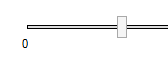
Track Border Color (Slider Control)
When applying a Track Border Color to the Slider control, the Track Border Width should be greater than 0.
Web Browsers and System Colors
Colors selected from the System tab (see image below), of the color chooser, may not display exactly as shown in the Form Designer when a form is viewed in a browser.
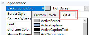
System color mapping occurs server side which means if these colors are used, the server theme colors will be sent down to the client.
System colors defined in CSS2 are very unreliable, and indeed, deprecated in CSS 2.1.
A web system color can be forced on the browser by prefixing the system color name with "!", in a rule, for example the rule:
="!ActiveBorder"
This will cause the system color ActiveBorder to be sent all the way to the browser.
We strongly recommend using hexadecimal values or colors selected from the Web tab of the color chooser for the Web.
To Change the Default Value
Ensure the property is a static property (the gray orb will be displayed alongside the property name)
The default value of the static property can be changed by one of the following methods:
- Using the Color Chooser.
- Click in the property for the control to be changed
- Click the drop down list at the end of the property value field
- Select the color tab to use (Custom or Web)
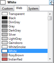
- Select the required color from the list.
- Typing the Color name or Hexadecimal value.
- Click in the property for the control to be changed
- Type the name of the color or it's hexadecimal value directly into the property field.
Examples
| Color Property Value (static) | Result |
|---|---|
| White | Changes the color of the control to white |
| Transparent | Changes the color of the control to be transparent |
| #644B47 | Changes the color of the control to be the color of the hexadecimal value #644B47 |
A rule can also be built for this property by changing the type to dynamic.
See How To: Change A Static Property To A Dynamic Property.
| Color Property Value (dynamic) | Result |
|---|---|
| ColorHex(56,129,205,255) | Changes the color of the control to be the hexadecimal equivalent of the RGB and Opacity values 56, 129, 205, 255. |
| ColorHex(RedReturn, GreenReturn, BlueReturn, OpacityReturn) | Changes the color of the control to be the hexadecimal equivalent of the RGB and Opacity values coming from the corresponding controls. |
Value set in Form Designer. For DriveWorks projects static properties can be made Dynamic by double clicking the gray radio button.
- Welcome
- What's New
- DriveWorks 23
- Older Versions
- DriveWorks 22
- DriveWorks 21
- DriveWorks 20
- DriveWorks 19
- DriveWorks 18
- DriveWorks 17
- DriveWorks 16
- DriveWorks 15
- DriveWorks 14
- DriveWorks 12
- What's New DriveWorks 12
- Form Design
- Rule Builder
- Model Rules
- DriveWorks Add-in for SOLIDWORKS
- SP1
- SP2
- DriveWorks 11
- Welcome to DriveWorks Solo 11 What's New
- Capturing
- Project Designer
- Installation
- Licensing
- SP1
- SP1.1
- SP2
- SP3
- V10
- V9
- V8
- SP0
- SP1
- SP2
- SP3
- V7
- Before You Begin
- Using DriveWorks Solo
- DriveWorks Solo Inside SOLIDWORKS
- Enabling the DriveWorks Solo Add-ins in SOLIDWORKS
- Project Wizard
- Capturing Models
- Captured Models
- Part Mode
- Assembly Mode
- Drawing Mode
- Run
- Run (Layout Mode)
- Project Designer
- Project Designer
- Stage 1: User Interface
- Stage 2: Data and Rules
- Stage 3: Output Rules
- Writing Rules
- Writing Rules
- Rules Builder
- Extract Variable
- Edit Variable
- Rule Builder Settings
- Document Rules
- Model Rules
- Model Rules Overview
- Parts and Assemblies
- File Name
- Relative Path
- Configuration
- Feature
- Dimension
- Tolerances
- Custom Property
- Instance
- File Formats
- Advanced Feature Parameter Rules
- Model Rules Advanced Feature Parameter Rules - Overview
- Boss/Base Features
- Boss/Base Thin
- Break Corner
- Chamfer
- Circular Component Pattern
- Circular Pattern
- Coordinate System
- Cosmetic Thread Features
- Curve
- Curve Driven Pattern
- Curve Through XYZ Points
- Cut Features
- Distance Mate Features
- Draft
- Edge Flange
- Features
- Fillet
- Hole Wizard Features
- Linear Component Pattern
- Circular Pattern
- Linear Pattern
- Lofted Bend
- Mates
- Mold Features
- Offset Surface
- Pattern Driven Component Pattern (Derived)
- Patterns with Advanced Feature Parameters
- Revolved Boss/Base
- Revolved Boss/Base Thin
- Rib
- Ruled Surface
- Sheet Metal Features
- Simple Hole
- Sketch Driven Pattern
- Slot Mate
- Surface Features
- Sweep Thread
- Table Driven Pattern
- Var Fillet
- Weldment Features
- Wrap
- Drawings
- Functions
- Functions
- Conversion
- Cryptography
- Date and Time
- File System
- Helper
- Lambda
- List
- Logical
- Math
- Specification
- Table
- CountIF
- CSVFromTable
- Dcount
- DMax
- DMin
- DWHLookup
- DWVLookup
- GetTableValue
- HLookup
- ListAll
- ListAllConditional
- ListAllConditionalDistinct
- ListAllDistinct
- SumTableColumn
- TableAppendColumns
- TableAppendRow
- TableAppendRows
- TableAverage
- TableBreak
- TableColumn
- TableColumnLookup
- TableCombine
- TableDistinct
- TableDistinctCount
- TableDistinctSum
- TableFilter
- TableFilterAll
- TableFilterByList
- TableFormat
- TableFromCsv
- TableFromList
- TableGetColumnCount
- TableGetColumnIndexByName
- TableGetDataRows
- TableGetHeaderRow
- TableGetRowCount
- TableGetRows
- TableGetValue
- TableJoin
- TableMax
- TableMaxValue
- TableMin
- TableMinValue
- TableRemoveBlankColumns
- TableRemoveBlankRows
- TableRemoveColumn
- TableRemoveRow
- TableReplaceHeaderRow
- TableReplaceHeaders
- TableReplaceRow
- TableReverse
- TableRow
- TableSearch
- TableSelectColumns
- TableSequence
- TableSkipRows
- TableSort
- TableSortByDate
- TableSortByList
- TableSubstitute
- TableSum
- TableTakeRows
- TableTranspose
- TableWithSequence
- VLookup
- Text
- Validation
- Variables
- Knowledge Base
- Concept
- How To
- How To: SolidWorks Best Practices
- SOLIDWORKS Best Practices (KB13103019)
- SOLIDWORKS Features
- How To: Correctly Format Text
- How To: Backup a Project (KB13022601)
- How To: Change A Static Property To A Dynamic Property (KB13111201)
- How To: Create A Cut Down Project (KB17092602)
- How to: Create and Install Project Templates
- How To: Determine the Version of DriveWorks Solo
- How To: Diagnose Project Issues
- How To: Diagnose Project Issues Using On Demand Generation Report
- How To: Diagnose Project Issues Using The Form Designer
- How To: Diagnose Project Issues Using The Rules Builder
- How To: Diagnose Project Issues Using SOLIDWORKS
- How To: Drive the Color of a Part (KB12121016)
- How To: Drive the Material of a Part
- How To: Drive the Texture of a Part (KB13103010)
- How To: Find DriveWorks Solo License Keys
- How To: Implementation Guide
- How To: Reference Control Properties (KB16010601)
- How To: Rename a Project
- How To: Replace a Component With a Static or Driven Replacement Model
- How To: Replace An Instance With A Driven Replacement Model
- How To: Maintain Rules For An Existing Model When It Becomes A Child Of A Parent Assembly
- SOLIDWORKS Best Practices (KB13103019)
- How To: Troubleshoot Licensing
- How To: Troubleshoot WebView2 Runtime Installation (KB25102401)
- How To: Work With Arrays
- How To: Use Filters (KB15111101)
- Info
- Form Control Properties
- Color
- Border Style
- Border Width
- Button Layout
- Caption, Text (Appearance Property)
- Caption Horizontal Alignment
- Button and Caption Width
- Character Limit
- Check Alignment, Option Alignment
- Checked
- Check Size, Radio Size, Button Icon Size, Toggle Size
- Clear Selection Allowed
- Decimal Places
- Default Value
- Display Value
- Enabled
- Error result
- File Name
- Font
- Height
- Hide Characters
- Hover, Text Underline
- Hyperlink
- Button Icon Style
- Increment
- Inset Track
- Input Spacing
- Items
- Left
- Link Behavior
- Maximum
- (Metadata)
- Minimum
- Multiline
- Name
- Number Of Rows
- Opacity (Disabled)
- Orientation
- Override Rule
- Padding, Input Padding, Unit Padding
- Picture
- Picture (Checked), (Hover), (Selected), (Pressed)
- Picture Size Mode, Size Mode
- Picture Style
- Placeholder Text
- Border Radius
- Read Only
- Reverse Direction
- Selected Item
- Selected Item Removed Behavior
- Show Border
- Show Check, Show Option
- Show Limits
- Show Toggle Indicators
- Size Mode
- Tab Index
- Tag
- Text Horizontal Alignment, Toggle Alignment
- Text (Label Control)
- Text, Value (Behavior Property)
- Text, Vertical Alignment
- Thumb Height
- Thumb Image
- Thumb Image Size Mode
- Thumb Margin
- Thumb Padding
- Thumb Width
- Tooltip Duration
- Tooltip Text
- Top
- Track Color
- Track Color (Fill)
- Track Fill Start Value
- Track Size
- Visible
- Width
- Word Wrap
- File and Template Locations
- Info: DriveWorks File Extensions (KB13022602)
- Info: File and Template Locations (KB13103001)
- Template Files
- Lists and Preferences
- Reporting
- Help File
- General Information
- Info: Dangling Dimensions
- Info: Distributing A Solo Project
- Info: DriveWorks Solo Limits
- Info: Instant3D
- Info: Keyboard Shortcuts (KB13103004)
- Info: Known Issues (KB13103005)
- Info: Legal Notices
- Info: Microsoft .NET September 2022 Update Crash (KB22101401)
- Info: Mirrored Components
- Info: SOLIDWORKS System Options (KB12121012)
- Info: Special Variables
- Info: Supported DriveWorks Versions (KB13103006)
- Info: Third Party Information And Downloads
- Info: Microsoft Windows Support (KB13010803)
- Info: Working With SOLIDWORKS Enterprise PDM
- Glossary