Table Visualization
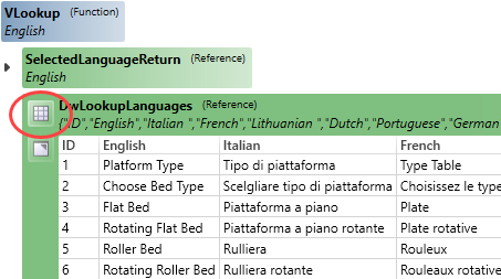
Tables and arrays used in any rule can be visualized directly in the Rule Builder.
This assists with easily identifying the correct columns and rows are used in the rule.
Release Notes
SOLIDWORKS 2022, 2023 and 2024 are fully supported.
Microsoft Windows 10 and 11 are fully supported.
Focused visual updates and enhancements add further functionality across DriveWorks.
Tables and arrays used in any rule can be visualized directly in the Rule Builder.
This assists with easily identifying the correct columns and rows are used in the rule.
New features to further the Design Automation capability.
Control the Blind Depth of a Cosmetic Thread.
Control the Flip alignment of a Coordinate System.
Skip instances of a Derived Pattern.
Drive parameters of the Lofted Bend feature.
Additional functionality for your user experience.
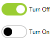
The Toggle Switch allows on or off (yes or no) selections to be made with a modern look and feel.
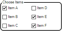
The Check Box Group allows multi-selection of a group of static or dynamic items.
Web Form Technology has enabled the addition of form control properties to completely style controls for a completely modern look.
More elements of Controls can have a color applied, along with (where applicable) the state of a control (Hover, Disabled, Pressed, Focus, checked)
Apply border radius to controls for a modern styling.


Add a border to the Hyperlink and Label control.
Specifies the width of the control's border.
Available for Hyperlink and Label Control.
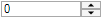
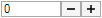
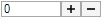
Set the size of the icon shown on the Spin Button Control.
The Spin Button allows a choice between the following to display for the icon:


The Spin Button allows a choice between the following to layout the button icon:

Specifies the spacing between inputs in the control.
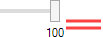
Sets the space between the thumb (grab handle) and unit elements
Sets the space between the input and button elements

Set the Button Width of the Spin Button.
The Padding property controls:
Specifies the opacity when the control is in a disabled state.
Opacity (Disabled)Controls the size of the check in the Check Box control or the size of the radio in an Option control.
Controls the vertical alignment of text in the control.
To accommodate the addition of all these new properties, Appearance Properties are now organized into the following categories in the Control Property Grid:
Additional functionality for your user experience.

BorderRadius assists in creating the format required to apply a rounded edge for the Border Radius Property.